
Visualising Excellence: A Guide to Showcase Your Research Portfolio
We check out Yejin Choi's research as an example of how Maps can be used to celebrate and explore research portfolios.

Progress in science in undoubtedly the collective efforts of countless scientists over generations, pushing the envelope of what is known. However, it’s also important to take time and recognise the individual contributions of particular scientists and innovators. As a budding researcher or student, it can be inspirational to review the career of successful scientists. On the flip side, experienced researchers benefit from reviewing their own work and the contributions of others, to observe how a field has evolved over time.
Here, we dive into an example portfolio of Yejin Choi, a 2022 MacArthur Fellow with notable contributions to AI and language modelling. We review her life’s work and key contributions using Maps. What’s more, using our new guide can help you create this kind of map on your own.
You can also see this map in Litmaps by going here.
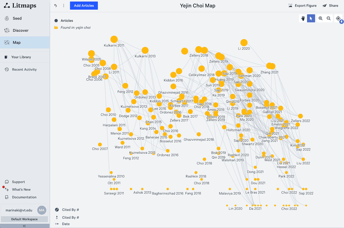
Example research portfolio: Yejin Choi
Yejin Choi is a 2022 MacArthur Fellow and AI researcher of 20 years focusing on language models, and a recent TedTalk speaker on Why AI Is Incredibly Smart and Shockingly Stupid. Choi is inspirational in her significant contributions to the field, passion for her work and hope for the future.
Reviewing her life’s work and examining her career gives us a glimpse into how she got to be where she is. Sifting through all her papers would take hours and reading interviews would leave out many details. By building a visual map of her work, we can see the impact she’s had and how her work has evolved over time. Most importantly, the process takes only a few minutes.
Recent innovations of Choi’s work: text and visual models
Among Choi’s various contributions to the field of natural language processing (NLP), one of her more recent innovations was combining both visual and text inputs for these systems. Traditionally, NLP models were trained solely with text inputs, but Choi has designed models with both text and image inputs, allowing each to reinforce the other. This is similar to how people learn about the world, by having visuals reinforce text and vice-versa.
On the map, this advancement is quickly revealed by setting the x-axis to Momentum and y-axis to the citation count. Several papers from the last couple years standout and are related to vision-language models. That’s because Momentum is a measure of a paper’s citations adjusted for how recently the paper was published. By sliding the Time Adjustment to the right, we quickly reveal the most recent and impactful papers.
Biggest contributions: ATOMIC, COMET, SWAG
Among the many important works Choi has contributed to, some have had an even bigger impact than others. For example, her dataset ATOMIC is widely used to help train models to have commonsense. After that, her team then went on to make a neural network-based NLP system using ATOMIC. That system, COMET, was highly successful in its ability to generate novel commonsense knowledge.
By visualising her papers as a function of Map Relevance, we can quickly see ATOMIC, COMET and similarly high-impact papers bubble to the top. Map Relevance corresponds to an article’s number of citations within the map. Naturally, the more impactful a researcher’s paper is, the more often it will be cited in future publications, and thus it will have a high map relevance.

Curious how this looks for your own work or someone else’s? Check out our new guide for how to create this kind of map on your own. Share with us your research portfolio or a scientist of your choosing by tweeting your maps at us @LitmapsApp!
Resources
Yejin Choi, Computer Scientist| 2022 MacArthur Fellow
Academic minds ‘vital’ as fears grow over ‘out of control’ AI
Failing your way to academic success
How A Growth Mindset Fuels Innovation
Three cornerstones of a successful research career
The Top 5 Qualities of Every Good Researcher