
Beautiful Visualisations Change the World
Climate change, war, COVID, inequity - data visualisations play a key role in communicating all these issues. By prioritising both form and function, we can create visuals that change the world.

Data visualisations are akin to book-covers — concisely telling the whole story of what could be thousands of pages of text and raw data. The attention we give to visualisations is a testimony to their integral importance in society. Effective visuals are the difference between just making discoveries versus transforming the world with those discoveries. Litmaps tools reflect this priority, recognising that how effectively we portray papers directly impacts what insights can be derived from them. That’s why our underlying visualisation engine was built from scratch, enabling maximum flexibility in what we do.
But visualisation tools like Litmaps are just localised examples of a broader philosophy: visualisations are vital storytelling mediums, that require equal attention for their form and function. Here, we dive into a brief history of data visualisation and discuss a handful of impactful, contemporary examples, in order to celebrate both the science and art that is data visualisation.
“The greatest value of a picture is when it forces us to notice what we never expected to see.” - John Tukey, Exploratory Data Analysis (mathematician who invented the boxplot)
Why are data visualisations important?
Although most people agree that visualisations are a handy tool, some skepticism still abounds regarding their fundamental utility. At Litmaps we argue that good data visualisations are essential to understanding and sharing ideas that otherwise couldn’t be put into context.
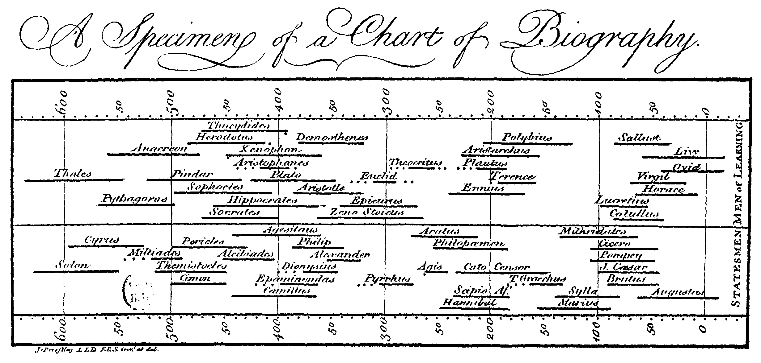
The earliest forms of data visualisation date back to star charts and maps, used thousands of years ago to assist in navigation. As the centuries progressed, ideas evolved over what types of data could be visually represented. For example, one of the first visualisations of historical data — as depicted by the lifespans of famous people — is John Priestley’s 1765 Chart of Biography. In this way, types of visualisations could be considered like a technology, steadily applied to more and more domains, contributing novel value to each one.
In A Brief History of Data Visualization, Michael Friendly argues that innovations in data visualisation often arose from practical goals, as much as from innovations in technology, data collection and statistical theory. This was clearly true for the creation of star charts, and remains equally relevant today, as we attempt to visualise multidimensional data effectively.
Why we need better visualisations
The human mind isn’t equipped to review tabulated data — we aren’t machines — but our power of observation and visual perception does make us prime targets for effective imagery. Even something as simple as basic boxplot illustrates this point effectively. By summarising thousands of raw numbers into a basic image, simple box and whisker plots give us the ability to quickly draw insights we couldn’t infer from raw numbers manually.
Yet, simply visualising data is just half the battle. The other half involves understanding human perception and designing visualisations based on how they will be interpreted. Succeeding at both ends results in getting the desired story across. Given that research stories are of increasingly paramount importance — explaining climate change or social inequity — the need for clear data visualisations has never been greater. In fact, their influence is sometimes best illustrated in the negative. For example, the misinformation that results from misleading visuals can be catastrophic, as was illustrated during the COVID-19 pandemic. Battling misinformation, and preventing it in the first place via responsible visuals, reflects the broader challenges in science communication in general.
The responsibility for accurate visualisations is a shared task, affecting all communicators, including researchers, journalists, and content creators. Organisations like the Google News Initiative try to help prevent misinformation by providing training and resources, recognising the importance of visualisations.
Beautiful and effective visualisations
An effective visualisation is one that quickly communicates an idea, without bogging the viewer down with unnecessary detail. Effective visualisations are often also beautiful. The concept of beauty here refers as much to style and aesthetics as it does to clarity and transparency. Beauty and function play equal roles in telling the visualisation’s message.
Although plenty of guidelines exist, a few, simple rules dominate the visualisation landscape. Effective visualisations respect Gestalt principles, or general laws reflecting how we perceive the world. For example, the proximity principle stipulates that objects close together are grouped together. These and similar principles help guide effective visual design.
Below, we display a series of exemplar visualisations that clearly tell a story at a glance, while upholding a certain level of elegance.

Redlining is a tragic, yet familiar term, to those in the United States, referring to the impact of historic and modern-day racism on housing. The visualisation above (interactive on the site) depicts Birmingham’s “hazardous” zones versus total area, coloured according to demographic. It effectively shows how most formerly redlined areas — those where lenders would originally draw a “red line” around and not invest in — are still starkly segregated today. It’s a vital piece of history that lives on clearly in the economic divide between black and white Americans.
The visualisation itself is effective in showing the larger proportion of black Americans in the hazardous zones on the left, and how this compares to the greater area of Birmingham on the right. Change “hazardous” to “best” on the site to see how the visualisation changes.

This interactive visualisation from Information is Beautiful depicts the largest data breaches since 2004, linking each to a relevant news report. Just a glance reveals Facebook as the two largest markers in 2022, with the Shanghai Police and Syniverse just behind.
Scrolling down on the site itself, the visualisation really starts to take shape. It’s instantly apparent that the size of breaches are dramatically larger since 2014, as compared to any before then. The increase in both scale and volume of breaches over time are obvious with just a glance.

The ongoing war between Ukraine and Russia has as much to do with military might as it does resources. The visualisation above depicts the world leading oil producers, with Russia in position number two, as well as the countries which rely on Russia most heavily. From a brief examination, the complexities of resources and war can be digested. Belarus and China depend heavily on Russian oil. Not coincidentally, their greyed-out names indicate they do not support sanctions.
See the entire visualisation and others infographics regarding the Ukraine-Russian war at the Information is Beautiful site.
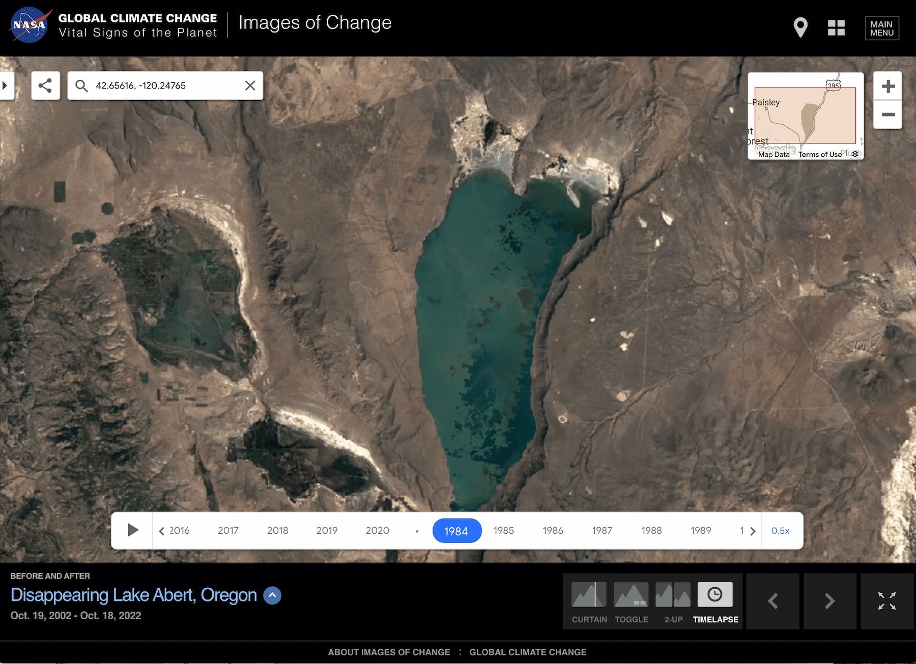
The NASA time lapse above depicts how Lake Abert, a lake in the United States, has been slowly drying up over the last couple of decades. Although it is visually simple in nature — simply a series of photos in time — it is obvious in its message that climate change is effecting the environment. Scientists studying the lake found there were fewer days of snow cover and higher surface temperatures, which leads to more water evaporating and the shrinking of the lake itself. What we can’t see are the tens of thousands of birds who migrate here, whose main food source in the lake is dwindling due to these environmental changes.
Much effort is put into effective climate change visualisation, as it’s a persuasive and effective mean by which to influence public opinion and behaviour.

This visualisation — too large to fully capture here — presents a succinct summary of the deadliest pandemics throughout human history. Each virus is to scale based on the number of deaths attributed to it, situated on a timeline beginning from year 0 of the common era. Although not captured in the screenshot above, COVID-19 sits at the bottom, with a toll of 6.9 million.
However, without the worldwide population accounted for visually, it’s difficult to interpret the relative fatality. COVID-19 represents 6.9 million out of 7-8 billion people, where as smallpox killed about 56 million at a time when the world likely had half a billion people in it. For a viewer not considering the idea of relativity, the graphic could be misleading, whether to undermine or over-emphasise the severity of COVID. Yet, this lack of visualised data (population) is just one example of the trade-offs all visualisations come with: simplicity at the cost of information.
Altogether, the above examples demonstrate the utility of data visualisations to communicate big ideas, and doing so following clear design and aesthetic principles.
What’s a visualisation that you’ve found particularly compelling? Share with us your thoughts on the importance of data visualisation today by commenting below or tweeting at us @LitmapsApp.
Resources
Visualization interest group (VizTIG) at The Alan Turning Institute
9 best practices and tips to follow for effective data visualization, 2023
Five Key Commandments Of Data Visualization, 2023
Key Elements & Principles of Visual Design, from Interactive Design Foundation, 2022
Principles of Effective Data Visualization, 2020
40 charts that explain the world, 2014
A Brief History of Data Visualization, Michael Friendly, 2006